Making it easier for families to get insurance coverage by simplifying how they apply.
6 min read
GoLife is a startup focused on helping Canadian families access affordable term life insurance. We created a B2C MVP web app that simplified a traditionally complex application process, reduced advisor workload, and secured a national insurance partnership.
The Opportunity
Term life insurance offers significant coverage for a relatively small cost, making it ideal for young families. But it's also a low-margin product—group insurance advisors often lose money due to the time required to support each customer. As a result, it's rarely offered to those who need it most.
Outcomes.
Less time spent per application Strategic milestone for the startupReduced time to complete applicationsMore policies issued in the first 3 months than the previous year Customers finished the application process.Advisors began using GoLife in their first three months"It surprised me how painless doing something online could be."
The Team
Creative strategy Vendor Management Design Direction Research UX / IA HTML/CSS Manny Park UI Yoon Lee UI/Animation Lanny McNie Proj. Manager Trevor Dunn Dev Alex Garneau Dev Chad Viminitz Content Andrew Embury Mograph Artist Joey Peppin Voice Over Artist Misty Lee Voice Over Artist
The Challenge
How might we make the application process simpler, faster, and more enjoyable for parents?
The Basics
Group insurance advisors and parents with young children.An MVP consumer-facing web app with an administrative backend, focused on streamlining insurance applications.Desktop and mobile browsers.During the insurance application process.To make term life insurance more profitable for advisors and more accessible to families.
Vision
GoLife is a trusted, knowledgeable, and supportive guide—like a friend in the insurance industry. They simplify, demystify, and humanize the application experience. No pressure. Just help.
Considerations
Parents of young families who want a trustworthy, easy application process.Advisors who want to reduce time spent on low-margin products.Deep industry knowledge shaped content and strategy.Competitors use bare-bones forms that look like standard forms. These are boring and lead to a feeling of monotony as participants fill out their application.Traditional forms were dull, repetitive, and disengaging.
Research insights
Process mapping uncovered friction points, automation opportunities, and UX gaps in customer and advisor experience.
Group advisors invested ~4 hours per term-life applicationCustomers took ~2 hours to complete applications due to confusion, repetition, and poor explanationsGet it done fast without getting needless detail.Help understand jargon, unfamiliar concepts, and the things I don't know but should when I need it.90% of customer questions were repetitive - answer these questions earlyThinking about death is hard; focus on protecting loved ones.Mandatory reviews and legal language were unavoidable
Guiding Principles
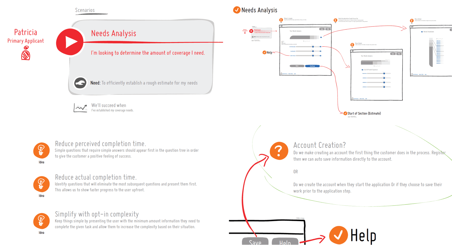
Reduce actual and perceived form length.Keep users motivated with emotional connection and positive reinforcementAutomate, pre-fill, and remove redundancy.Provide relevant, non-intrusive, opt-in suppor.tShow progress and more milestones.Reward completion with uplifting feedback.
Core Strategy
Break the process into smaller, digestible chunks. Make it feel like progress—not paperwork. Use crafted design elements, light interactions, and opt-in complexity. Provide support without breaking flow.
Exploration
We partnered with advisors to conduct interviews, run workshops, and prototype ideas across the product lifecycle. Personas, journey maps, and wireframes grounded our design in real user needs.
User personas were developed, scenarios were mapped, sketches were penned, and wireframes developed. We explored potential features, alternate application flows, and experiences that aligned with our research insights and guiding principles, and core strategy.
Mapping the journey
We broke the application process into smaller tasks. Each task had a clear job to complete. This process let us identify pain points, opportunities, and ideas that aligned with our approach.
User scenarios and wireframes
An iterative process
Early, low-fi, iterations helped test concepts and let us make big changes quickly and inexpensively. With every iteration having higher-fidelity, we were able to refine critical details and fine-tune the experience. Simple technical spikes allowed us to testing and validation design concepts quickly.
Lo-fi to hi-fi prototyping.
Solution
We created a cohesive product experience that delighted customers. The application process was easy to complete, and it reduced the time advisors invested in the process.
"I don't think there's anything more you can do to make it easier for tech illiterates... Extremely easy, extremely fast, highly recommend."
A simplified experience.
We designed an experience that separated the application process into smaller pieces, made it look less like a form, and removed repetition.
Remind them of their why.
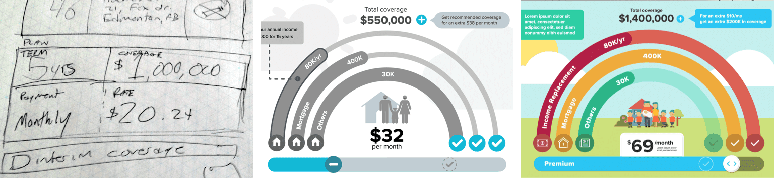
We use data to personalize their experience. For example, their marital status and number of children appear in an interactive infographic. When the families' financial needs are covered, they jump for joy.
Built-in shortcuts.
Re-use of data captured during account creation and the needs analysis let us pre-populate the application form. By the time people see anything that looks like a typical form, they are 45% through the process.
The form defaults to the shortest possible length. We only add new form fields based on people's individual needs as they progress.
Help when it's needed.
People that want more information during the application process have instant access to help. An overlay with answers to faqs for a specific form field provides support to people without leaving the application flow. Correcting errors and completing skipped sections is simple and fast.
Live support is also available anywhere in the application process and connects customers to a certified insurance advisor.
Provide encouragement.
Providing ongoing encouragment without impacting the speed of completion is important to our experience. People are rewarded with a unobtrusive animation and visible state change when people complete sections. A completion percentage for the application is always visible, showing them constant progress everytime a form field is completed—giving them a sense of accomplishment and helping them guage how much time is left.
Celebrate success.
Completing the application process isn't easy. You should feel good about completing a critical step towards protecting your families financial future. Our platform recognizes that achievement.